In the world of website design, it’s easy to overlook the importance of the humble footer. However, a well-thought-out website footer design plays a crucial role in enhancing user experience, improving site navigation, and supporting the overall website goals. This often-underappreciated element can make a significant difference in how users interact with and perceive your site.

This article, “How to Effectively Design Website Footers,” aims to provide web designers, web developers, UX/UI designers, digital marketers, content strategists, small business owners, and aspiring website creators with practical guidance, best practices, and real-life examples to create impactful website footers. We’ll cover essential footer elements, design tips and techniques, SEO considerations, and common mistakes to avoid, ensuring a smoother user experience and better website performance. Whether you’re a design student, a blogger, or a professional seeking to expand your knowledge in web design and development best practices, this article will equip you with the tools and insights needed to create an effective website footer design.
The Importance of Website Footers
Role in User Experience and Engagement
Website footers play a vital role in user experience (UX) and engagement. A well-designed footer acts as a foundation for the entire website, offering users easy access to important information and resources. It can be a user’s last point of interaction with your site, so ensuring that it is visually appealing and user-friendly is crucial for encouraging further engagement and return visits. By including helpful links, contact information, and other essential elements, footers can significantly improve the overall browsing experience and leave a lasting impression on your site visitors.
Providing Essential Information and Resources
One of the primary functions of a website footer is to provide users with essential information and resources in a convenient and accessible location. This may include contact details, social media links, site navigation, legal information, and more. A well-organized footer helps users find the information they need quickly and efficiently, reducing the likelihood of frustration or site abandonment. Additionally, presenting this information in a consistent and easily accessible manner across all pages of your site enhances the overall user experience and builds trust with your audience.
Supporting Website Goals and Objectives
An effective website footer design not only improves user experience but also supports your website’s goals and objectives. By incorporating calls-to-action (CTAs) such as newsletter signups, social media follows, or even product promotions, you can encourage users to take desired actions that align with your site’s objectives. Furthermore, a thoughtfully designed footer can improve site navigation and make it easier for users to explore your content, which can lead to increased engagement, higher conversion rates, and ultimately, better achievement of your website’s goals. In short, a well-designed footer is an essential component of any successful website strategy.
Essential Footer Elements
Contact Information
One of the most important elements to include in your website footer is your contact information. This typically includes your business address, phone number, and email address. Providing multiple ways for users to reach you not only makes it easier for them to get in touch but also builds trust and credibility with your audience. Be sure to keep your contact information up to date and consistent across all platforms to avoid any confusion or miscommunication.
Social Media Links
In today’s digital age, having a strong social media presence is crucial for any business or organization. Including social media links in your website footer encourages users to connect with you on various platforms, which can help increase brand awareness, foster community engagement, and drive more traffic to your site. Be selective with the platforms you include in your footer, focusing on those most relevant to your target audience and industry.
Site Navigation
A well-structured footer should include links to key sections of your website, making it easy for users to navigate and explore your content. Consider including links to your homepage, product or service pages, about page, blog, and any other important sections of your site. Organize these links in a clear and logical manner, using headings or categories if necessary, to help users quickly find the information they’re looking for.
Legal Information (Terms, Privacy Policy, etc.)
It’s essential to include links to your legal pages, such as terms of service, privacy policy, and any other relevant legal information, in your website footer. These links not only help ensure compliance with legal requirements and industry best practices but also contribute to building trust and transparency with your users. Providing easy access to this information demonstrates your commitment to user privacy and data protection.
Call-to-Action (Newsletter Signup, etc.)
Including a call-to-action (CTA) in your website footer can be an effective way to encourage users to take a specific action, such as signing up for your newsletter, downloading a resource, or making a purchase. A well-designed CTA should be visually appealing, concise, and clearly communicate the value or benefit the user will receive by taking the desired action. Be strategic in choosing the CTAs you include in your footer, focusing on those that best align with your website’s goals and objectives.
Design Best Practices
Visual Appeal and Layout
An attractive and well-organized footer design contributes to the overall aesthetic appeal of your website. To create a visually appealing footer, consider the following:
- Choose a simple and clean layout that’s easy to navigate and understand.
- Use consistent branding elements such as colors, typography, and logos to maintain a cohesive look with the rest of your website.
- Create a visual hierarchy using headings, icons, or separators to group related elements and guide users through the content.
- Ensure there’s ample white space to avoid overcrowding and clutter, allowing for better readability and a more pleasant user experience.
Accessibility and Responsiveness
To ensure that your website footer is accessible to all users, regardless of their abilities or the devices they’re using, follow these best practices:
- Use legible font sizes and high-contrast colors to improve readability for users with visual impairments.
- Implement semantic HTML markup and ARIA attributes to make your footer more accessible for screen readers and assistive technologies.
- Design your footer with responsiveness in mind, ensuring that it adapts seamlessly to different devices and screen sizes.
- Test your footer’s accessibility and responsiveness using tools like Google Lighthouse, WebAIM’s WAVE, or by manually checking it on various devices.
UX/UI Principles
When designing your website footer, keep user experience (UX) and user interface (UI) principles in mind to ensure a smooth and enjoyable experience for your site visitors. Some key principles to consider include:
- Clarity: Make sure your footer is easy to understand and navigate by using clear headings, concise labels, and a logical structure.
- Consistency: Maintain a consistent design and layout throughout your website, including the footer, to create a cohesive user experience.
- Feedback: Provide visual cues, such as hover effects or active states, to indicate clickable elements and help users understand how the footer functions.
- Efficiency: Organize your footer content in a way that minimizes the time and effort required for users to find the information they need.
Catering to Different Devices and Screen Sizes
With the increasing variety of devices and screen sizes available today, it’s essential to design your website footer to be responsive and adaptable. Here are some tips for creating a footer that works well on different devices and screen sizes:
- Use a mobile-first design approach to ensure your footer functions well on smaller screens and then scales up for larger screens.
- Implement a responsive grid system or CSS flexbox to create a flexible layout that adapts to various screen widths.
- Prioritize the most important content and elements for smaller screens, and consider using expandable sections or dropdowns to accommodate additional content on larger screens.
- Test your footer on multiple devices and screen sizes, and make any necessary adjustments to ensure optimal performance and usability.
SEO Considerations for Website Footers
Role of Footers in Search Engine Optimization
While website footers might not be the first thing that comes to mind when thinking about SEO, they can still play a role in improving your site’s search engine performance. Footers can provide search engines with additional context about your website and its content, which can contribute to better indexing and higher organic search rankings. By optimizing your footer content and implementing effective SEO strategies, you can enhance your website’s overall SEO performance.
Strategies to Optimize Footer Content for Organic Search Rankings
To make the most of your website footer from an SEO perspective, consider implementing the following strategies:
- Include relevant keywords in your footer content, but avoid keyword stuffing, which can lead to penalties from search engines.
- Ensure your footer contains unique, high-quality content that adds value to your users and avoids duplicating content found elsewhere on your site.
- Use clear, descriptive anchor text for footer links to help search engines understand the context and relevance of the linked content.
- Implement structured data markup, such as Schema.org, to provide search engines with additional information about your website and its content, which can improve indexing and search result appearance.
Importance of Keyword Integration
Integrating relevant keywords into your website footer content is an important aspect of optimizing your site for search engines. By including targeted keywords in your footer, you can help search engines better understand your website’s content and relevance to specific search queries. However, it’s essential to strike a balance between keyword integration and user experience, ensuring that your footer remains easy to read and navigate while still including the necessary keywords to improve your site’s SEO performance. Be sure to use keywords naturally and avoid overloading your footer with excessive or irrelevant terms, as this can have a negative impact on both user experience and search engine rankings.
Inspirational Examples of Well-Designed Footers
To gain inspiration and learn from successful examples, let’s analyze well-designed footers from various industries. By examining the layout, content, and design choices made by these websites, you can identify patterns and best practices to apply in your own projects.
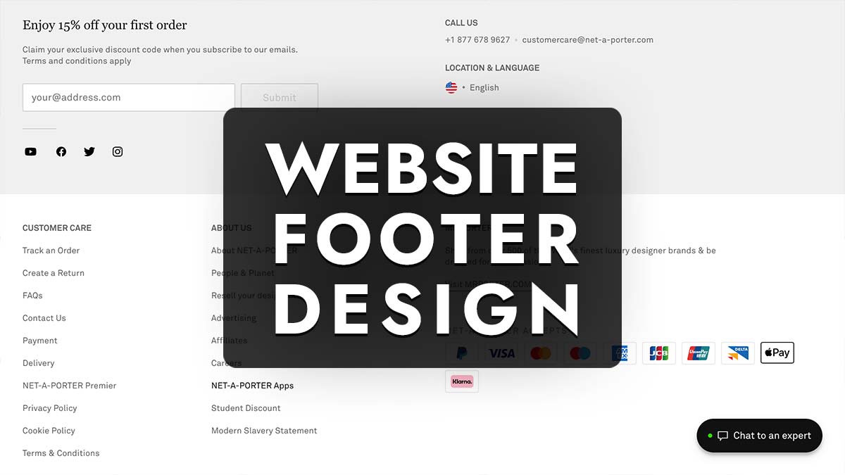
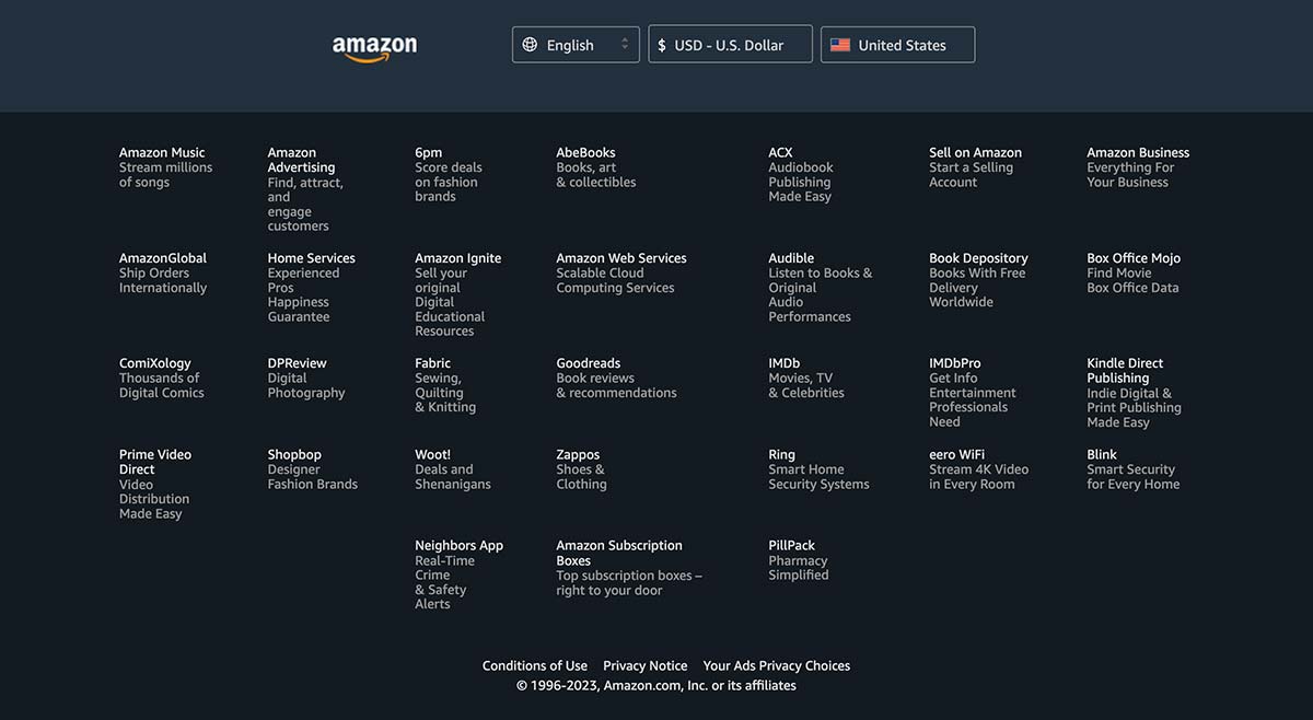
E-commerce: An e-commerce website footer might include links to customer service, shipping and return policies, payment options, and social media icons. Example: Amazon’s footer is clean and organized, with clearly labeled categories and easily accessible help resources.

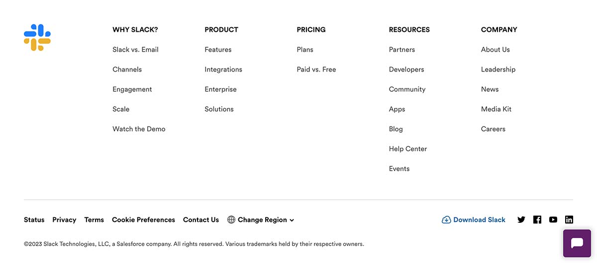
Software as a Service (SaaS): A SaaS website footer may feature links to product documentation, pricing plans, case studies, and customer support. Example: Slack’s footer highlights their brand personality and provides access to essential resources and social media links.

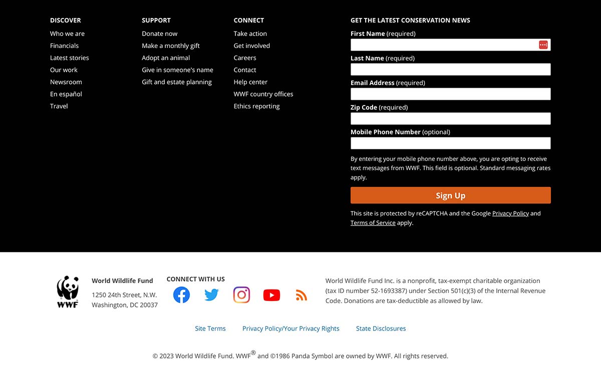
Non-profit organizations: Non-profit footers often include donation CTAs, volunteer opportunities, upcoming events, and links to their mission and impact stories. Example: The World Wildlife Fund (WWF) uses a visually engaging footer with bold graphics and clear calls-to-action, highlighting their cause and encouraging user involvement.

The following are some common layout, content, and design choices found in well-designed footers:
- Layout: Successful footers often use a simple grid or column-based layout to organize content and maintain a clean, uncluttered appearance.
- Content: Effective footers prioritize essential information, resources, and CTAs, tailoring their content to the needs of their specific audience.
- Design: High-quality footers use consistent branding, typography, and colors to create a visually cohesive experience while employing visual hierarchy to guide users through the content.
From these examples and observations, you can apply the following takeaways in your own website footer design projects:
- Prioritize user needs by including the most relevant and helpful information and resources for your specific audience.
- Opt for a clean and organized layout that makes navigation easy and enhances the overall user experience.
- Incorporate consistent branding elements and visually appealing design choices to create a cohesive and engaging footer.
- Use visual hierarchy and clear labels to guide users through the footer content and make it easy for them to find what they’re looking for.
- Learn from successful examples in your industry and adapt their best practices to create a footer design that suits your website’s goals and objectives.
Common Mistakes and Pitfalls to Avoid
Overcrowding and Clutter
One of the most common mistakes in website footer design is overcrowding and clutter. Including too much information or too many elements in your footer can make it difficult for users to navigate and find what they’re looking for. To avoid this issue, prioritize essential content and resources, and use ample white space to maintain a clean, organized appearance. If necessary, use expandable sections or dropdowns to accommodate additional content without creating visual clutter.
Inconsistent Design and Branding
Another common pitfall is inconsistent design and branding throughout the website, including the footer. Inconsistent design elements can create a disjointed user experience and make your website appear unprofessional. To ensure a cohesive look and feel, use consistent typography, colors, and other branding elements in your footer, and maintain a similar layout and structure to the rest of your website.
Poor Readability and Accessibility
Neglecting readability and accessibility in your website footer can create barriers for users with different abilities or using various devices. To improve readability, use legible font sizes and high-contrast colors. To enhance accessibility, implement semantic HTML markup, ARIA attributes, and follow web accessibility guidelines. By prioritizing readability and accessibility, you can create a more inclusive and enjoyable experience for all users.
Neglecting Mobile and Responsive Design
In today’s increasingly mobile world, it’s crucial to design your website footer with responsiveness and mobile devices in mind. Neglecting to optimize your footer for different screen sizes and devices can result in a poor user experience and even hurt your search engine rankings. To create a responsive and mobile-friendly footer, use a mobile-first design approach, implement flexible layout techniques such as CSS flexbox or grid systems, and test your footer on multiple devices to ensure optimal performance and usability.
Competitor Research in Footer Design
Analyzing your competitors’ website footer design can provide valuable insights and help you gain a competitive edge in the market. Understanding what works well for them and identifying areas where you can outperform them can lead to a more effective and user-friendly footer design on your own website. By studying their strategies, you can learn from their successes and avoid their mistakes, ultimately creating a more engaging and functional footer that caters to your target audience’s needs.
To conduct effective competitor research, first, identify your primary online competitors. These might include businesses that offer similar products or services, target the same audience, or rank for the same keywords as your website. Some methods for identifying competitors include:
- Searching for relevant keywords on search engines to find websites that rank highly for those terms.
- Analyzing industry-specific directories or online marketplaces to identify popular businesses in your niche.
- Asking your customers or clients about other businesses they’ve considered or interacted with before choosing your services.
Various SEO tools and platforms can help you analyze your competitors’ website footer designs and overall website performance. These tools can provide insights into their strategies, design choices, and content organization. Some popular SEO tools for competitor research include:
- SEMrush: This platform offers a range of features for competitor analysis, including keyword research, backlink analysis, and traffic analytics. SEMrush can help you discover the keywords your competitors rank for and how their website footers contribute to their overall SEO performance.
- Ahrefs: Ahrefs is another powerful tool for competitor research, offering comprehensive information about your competitors’ backlink profiles, organic search rankings, and keyword strategies. You can use Ahrefs to analyze their website footers and gain insights into their design choices and content organization.
- Moz: Moz’s suite of SEO tools includes features for competitor analysis, such as keyword research, site audits, and backlink analysis. By using Moz to study your competitors’ website footers, you can identify trends and best practices to apply in your own footer design.
By leveraging these SEO tools, you can gain valuable insights into your competitors’ website footer designs and strategies, helping you make informed decisions and create a more effective, user-friendly footer for your own website.
Keyword Gap Analysis and Implementation
Keyword gap analysis is a process that involves comparing the keywords your website ranks for with those of your competitors. This analysis helps you identify opportunities to target new keywords, improve your content, and enhance your website’s overall search engine performance. To perform a keyword gap analysis, you can use tools like SEMrush, Ahrefs, or Moz, which offer features to compare your website’s keywords against those of your competitors and discover potential keyword targets.
Once you’ve compared your website’s keywords to your competitors’, you can identify areas of improvement and potential keyword targets. Consider the following factors:
- Keyword overlap: Identify keywords that both you and your competitors rank for. Analyze their performance and search for opportunities to improve your rankings.
- Missing keywords: Discover relevant keywords that your competitors rank for, but your website does not. Consider targeting these keywords in your content, metadata, and on-page elements to close the gap.
- High-performing keywords: Look for keywords where your competitors have a significant ranking advantage. Analyze their content and design strategies, and consider how you can improve your website to compete for those keywords.
After identifying potential keyword targets, incorporate them into your website’s content, metadata, and on-page elements, including your website footer. Keep these tips in mind while implementing your targeted keywords:
- Use keywords naturally: Integrate your targeted keywords into your footer content and other website elements in a way that feels natural and enhances the user experience.
- Maintain a balance: Avoid keyword stuffing, as excessive use of keywords can lead to search engine penalties and a negative user experience. Instead, focus on creating valuable and informative content that incorporates your targeted keywords in a balanced manner.
- Optimize metadata: Include your targeted keywords in your website’s metadata, such as title tags, meta descriptions, and image alt attributes. This helps search engines understand the context and relevance of your content and can improve your search engine rankings.
- Follow SEO best practices: While implementing your targeted keywords, adhere to SEO best practices, such as using header tags, internal linking, and ensuring your website is mobile-friendly.
By conducting a keyword gap analysis and effectively implementing the identified keywords, you can improve your website’s search engine performance, enhance user experience, and ultimately create a more impactful website footer.
Monitoring and Tracking Progress
Monitoring and tracking your website’s keyword performance and search rankings are essential for continuous improvement and maintaining a competitive advantage. Regularly assess your website’s performance using SEO tools and analytics platforms to identify trends, monitor progress, and detect any issues that may arise. By keeping a close eye on your keyword performance and search rankings, you can make informed decisions and adjustments to your website footer design and overall SEO strategy.
As you monitor and track your progress, be prepared to refine your strategies to stay ahead of your competitors and adapt to changes in search engine algorithms and user behavior. Continuously analyze your competitors’ website footer designs and strategies to identify new opportunities and best practices. Furthermore, be prepared to make adjustments to your content, layout, and design elements based on your ongoing analysis and feedback from your target audience.
Importance of Continuous Improvement in Footer Design
In the ever-evolving world of web design and digital marketing, continuous improvement is critical for success. Regularly updating and optimizing your website footer design not only helps you maintain a competitive advantage but also ensures that your website remains user-friendly, accessible, and engaging for your target audience. By staying up-to-date with the latest design trends, best practices, and emerging technologies, you can create a website footer that remains effective and relevant over time.
In summary, monitoring and tracking your website’s performance, refining your strategies, and prioritizing continuous improvement are essential steps to ensure the success of your website footer design. By following these practices, you can create an impactful website footer that contributes to better user engagement, increased conversions, and higher search rankings.
Conclusion
In this article, we’ve discussed the importance of website footers and their role in user experience, engagement, and search engine optimization. We’ve covered essential footer elements, design best practices, SEO considerations, and examples of well-designed footers from various industries. Additionally, we’ve explored the significance of competitor research, keyword gap analysis, and the ongoing monitoring and tracking of progress to create effective website footers.
We encourage you, our readers, to apply the principles and best practices discussed in this article to your website footers. By doing so, you can improve your site’s usability, aesthetics, and functionality, ultimately enhancing the user experience and contributing to better engagement, increased conversions, and higher search rankings. By continuously learning and adapting your strategies, you can create a website footer that not only serves its purpose but also stands out in today’s competitive online landscape. So go ahead, and start designing a more effective and impactful website footer today!
